In honour of our new exhibition, Papal Parchments and Blackletter Books, here’s a lesson on the history of the written word and why the text you’re reading now looks the way it does. Thanks so much to the exhibition’s curator, Robert Makinson, for this fascinating look back.
The Changing Written Word
The alphabet used by Western European languages today, including English, French, German, Spanish, Italian, and many others, is usually called the Latin alphabet or the Roman alphabet because it was first used by the ancient Romans to write their language, Latin. But although the letter forms may look familiar, they wrote their books very differently, so differently that they are nearly unintelligible to modern readers:
This image, taken from a reproduction of a Latin copy of Vergil from the fourth century, was produced during the later Roman Empire. While we can make out individual letter forms, such as the first seven letters spelling out the Latin word INFELIX (“unfortunate”), the text is very difficult to parse and read; this is because there are no spaces between words, no punctuation, and the letters are all majuscule, like our modern uppercase alphabet.
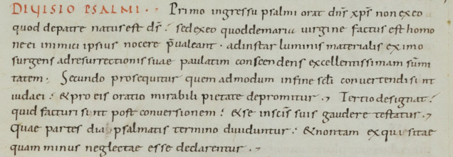
Four hundred years later, books would look very different. During the time of Charlemagne (c. 748-814), the emperor of the Franks (ancestors of the French), a new script was developed that was specifically designed for easy reading. Called Carolingian minuscule or Caroline minuscule—minuscule letters look like today’s lowercase alphabet—it allowed manuscripts to be produced with much fewer errors and eliminated much misunderstanding among readers.
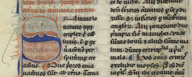
Many familiar features are starting to appear: there are spaces between words and some punctuation is present. But most importantly, distinctions are made between majuscule letters, found in titles and at the beginning of sentences and phrases, and the minuscule letters present everywhere else. These minuscule forms are very similar to the forms used by most modern fonts, and Caroline minuscule would dominate European books for nearly four hundred years, even inspiring the script used by the papacy for its official documents like papal bulls. After 1150, however, Caroline minuscule was gradually supplanted by a more compact, angular script called textualis, better known today by the misnomer “Gothic.”
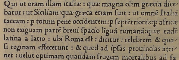
Eventually, Caroline minuscule was revived by the Italian Humanists in the fifteenth century, who wrongly believed that it was the script used by the ancient Romans. This adapted version of Caroline minuscule, which came to be known as Humanistic minuscule, in turn inspired many of the typefaces used by early printers. The very modern- and familiar-looking typeface below is representative of many books printed during this early period.
These typefaces, though they were subject to changing tastes over the centuries, became the basis for the fonts that we use today. The way we read and write, then, descends directly from the innovations adopted and adapted during the Middle Ages, especially the time of Charlemagne.
To see some of these documents in person, please join us for the exhibition Papal Parchments and Blackletter Books: How the Middle Ages Shaped the Way We Read, 1245 AD to UBC, which runs from May 1-31, Monday through Friday, 10 a.m. to 4 p.m. at Rare Books and Special Collections on the first floor of the Irving K. Barber Learning Centre. For more information, please contact Rare Books and Special Collections at 604 822-2521 or rare.books@ubc.ca.


